Publishing Tips: Typesetting Your Text – Professional or Not?

With the advent of DIY publishing where writers can publish their book with the click of a button, many concerns arise.
Unfortunately, many new writers make the mistake of using unprofessional design on the cover and typesetting throughout the interior of the book, which causes their first book to look highly unprofessional.
Unprofessional Typesetting Writers partnering with a publishing company is not necessarily free of concern either.
There are many publishing companies who still use Time New Roman, which is an unprofessional font to use, among others:
- Ariel
- Courier
Formatting
The design of the interior of your book, or the format, is a crucial element to ensure your book looks professional.
Some authors create their own typesetting and make these formatting mistakes:
- Double-spaced text
- Huge indents (tab is at 1/2 of an inch instead of 1/4 of an inch)
- Two spaces after periods Inch marks used ” instead of quote marks which should be curly or slanted
- Foot marks used ‘ instead of apostrophes which should be curly or slanted
If you don’t have your book formatted in the correct program (InDesign), you may end up with widows and orphans. Those are single lines at the beginning or end of a paragraph that are left at the top or bottom of a page, separated from the rest of the paragraph. Also part of formatting is where a chapter begins. Chapters should always start on the right hand page, which may indicate that you have a blank left page. Fiction can go either way, but a nonfiction title should always have chapters starting on the right hand page.
Editing
In addition, many authors don’t value or understand the inescapable importance of professional editing, therefore, their book remains full of grammatical errors, which results in bad reviews and credibility of the author ruined.
All of These Mistakes Add up to a Product That Looks Unprofessional.
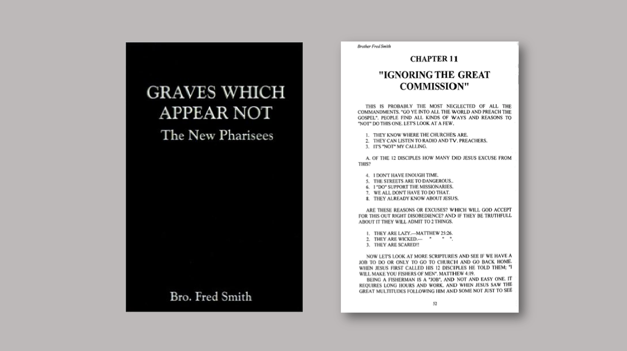
In this example, the book cover uses Times New Roman on the cover, which is an unprofessional font. In addition, the entire book was written in all caps and published that way, as you can see. Can you see the quote marks are actually inch marks?

In a case like this, Redemption Press would refrain from just publishing what’s been provided to us, but instead, we would either have to charge to retype it (in addition to editing the book) or have the author retype it in uppercase-lowercase. Either way, we would never just publish it as is, not with a cover like that, or with all caps and no editing on the content.
Publish Your Book with Excellence
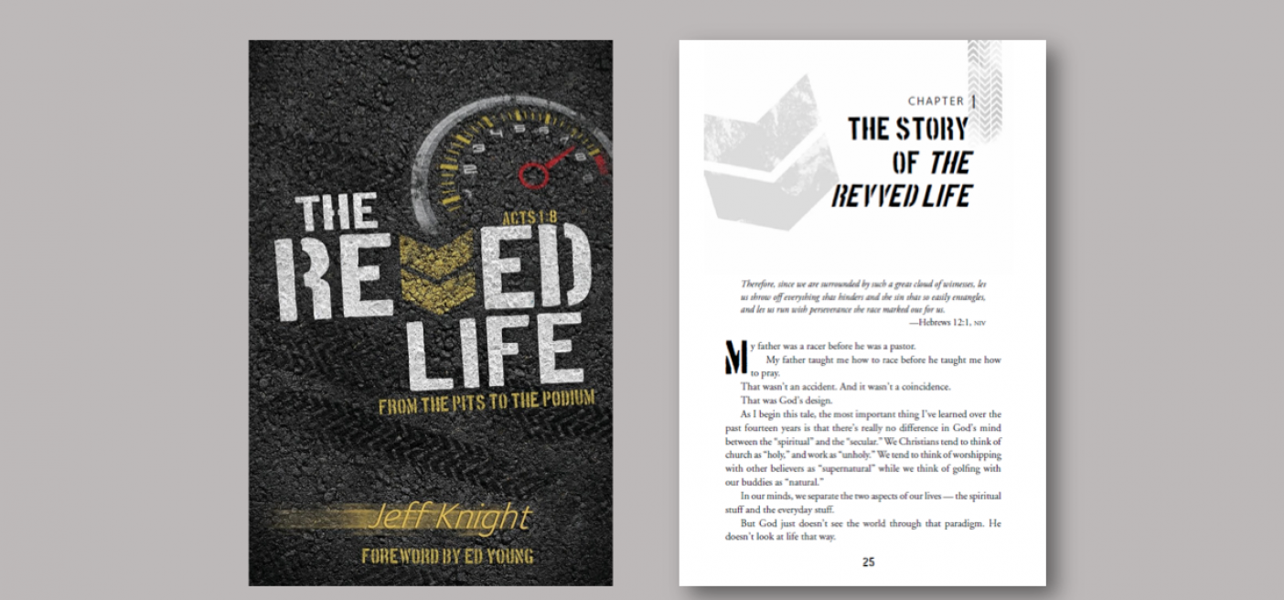
The look you choose for the cover of your book should flow throughout the interior as well.
There shouldn’t be a disconnect from the cover to the interior of the book. As you can see on this Redemption Press example, not only the fonts but some of the graphics used on the cover are utilized in the type setting. This presents a professional appearance and builds credibility.
So what’s our bottom line?
Communicate excellence through your product – from layout, design, type setting, and cover design. It all represents you and your message, and anything we do for the Lord should be done with excellence!
Like this post? Share with your friends.
Meet the Publisher

I've been around Christian publishing since 1987 when I helped our ministry self-publish an important resource for Vietnam veterans and their families. That book went on to be picked up by a royalty publisher and has since sold over 250,000 copies with a million in print.
I'm glad you're here…stop by often and take advantage of all the information we make available.


